ServiceMax is an enterprise software company that provides industry leading field service solutions to service organizations globally. These end-to-end field service solutions help dispatchers, technicians, and their administrators get through their work day so that they can keep wind turbines, jet engines, and the rest of the world up and running.
While I've spent time designing for both web and mobile, my work at ServiceMax has focused on forging a more seamless experience for technicians using phones and tablets. My days are spent thinking about how to support and motivate technicians to start, continue, and complete their work by focusing on providing more clarity in a revamp of ServiceMax's current mobile product. One project I worked on was the Appointment Detail screen. Part of this project also included a concurrent branding update to ServiceMax’s mobile product line. With that said, let’s go ahead and dive right in!
Objective
Design a concise but informational screen to provide technicians with the details they need when they need it
I worked closely with PM and Engineering to come up with a design fit for our on-the-go field service technicians, who need to quickly see certain details about their next appointment before arriving onsite.
Previously, a fixed set of details were gathered in a Summary screen (e.g., date, time, location, point of contact, etc.). We found that our diverse set of customers needed varying sets of details for their technicians. In order to support our user base, we decided to implement a more targeted UI that would allow admins to configure the appropriate details for their technicians. This way, technicians could spend less time tapping through our app and more time completing their day’s tasks.
Process
Prioritizing priority information
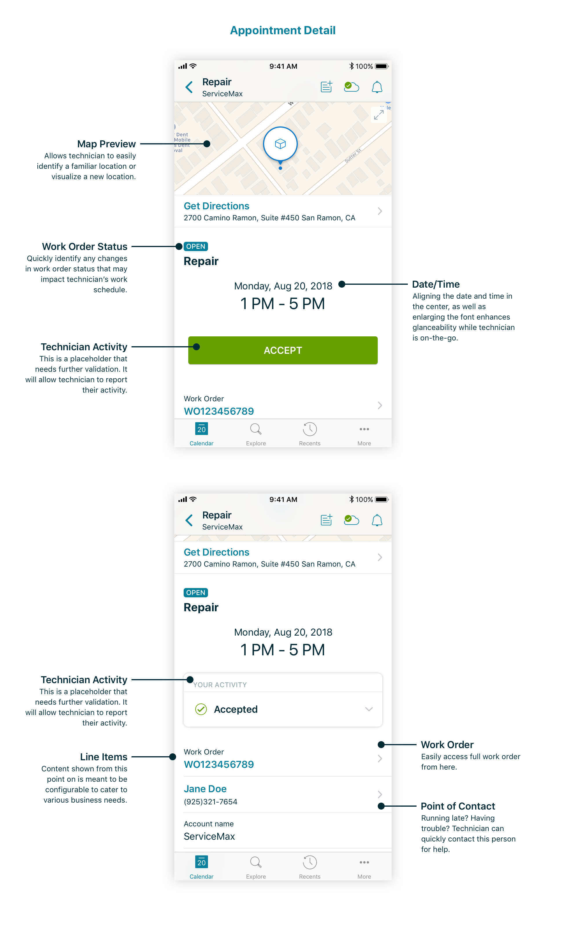
For a screen that contained purely pertinent information, it was still important to establish information hierarchy. I gathered insights from PM, customers, and business managers to better understand technicians’ work environment as they travel between appointments. It became clear that technicians were often on the move and needed to know date, time, location, and/or point of contact in order to get to their next appointment. It was also important to easily access the associated work order immediately after arriving onsite. Because most of these details were previously available in the Summary screen, it was important for the new design to present the details in a more meaningful way.
After seeking inspiration through competitive/comparative analysis, location and date/time were details that would be best presented with some sort of visual treatment.
Missing pieces… (WO Status and Technician Activity)
Early design ideas were shared with folks internally. They provided feedback that there were two pieces of information that would provide a more comprehensive experience for technicians. These two pieces were the work order’s status and the technician’s activity. The work order’s status was previously included in the work order, but not in the Summary screen. Together with PM and Engineering, we decided it would be viable to surface this piece of information in the Appointment Detail screen as a badge. The technician’s activity, however, proved to be a bit more finicky and controversial and the best option was to include a placeholder for technician activity that could be further tested.
Design Library
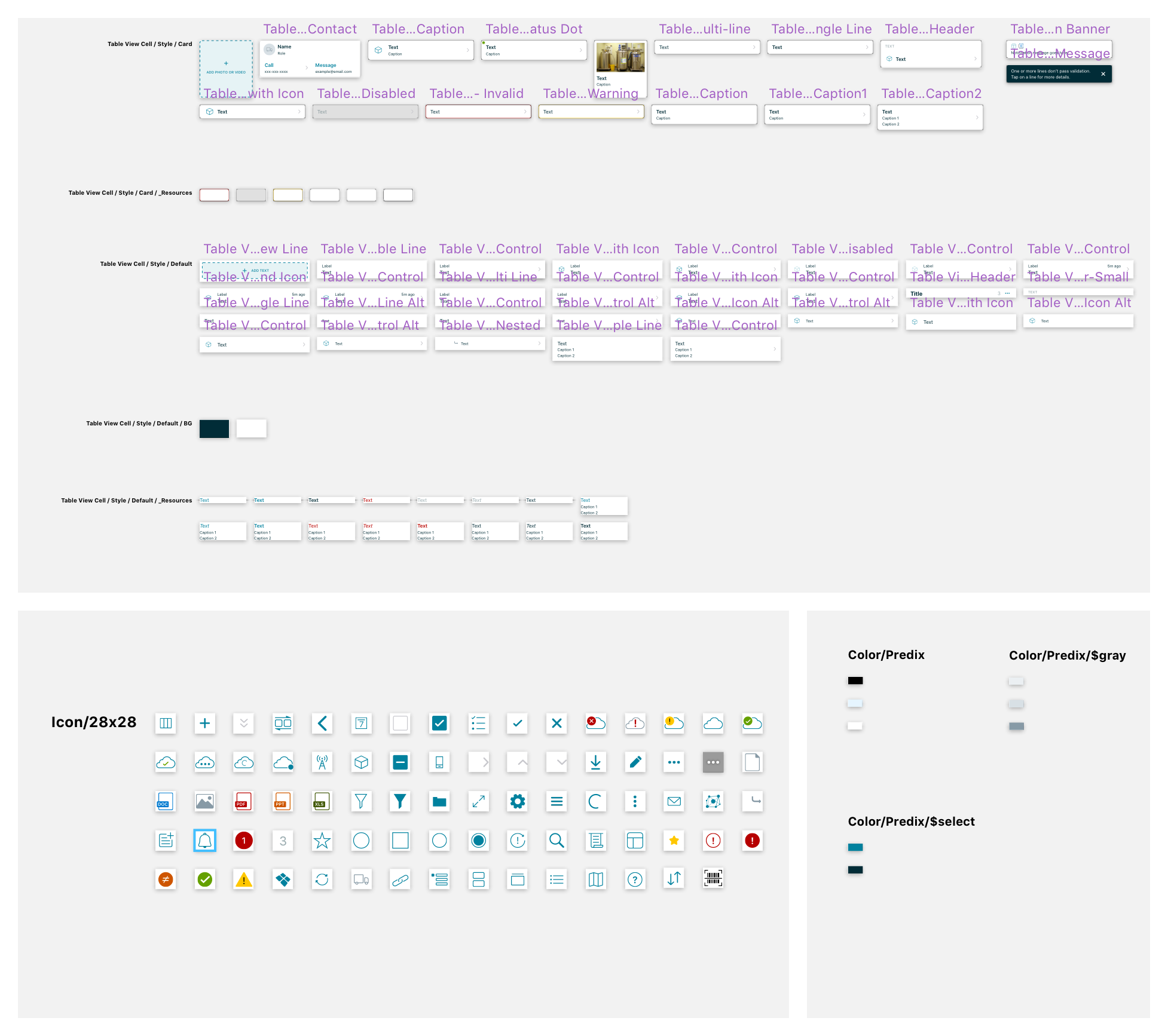
While some components were used from our new design library, some pieces were created specifically for the Appointment Detail screen. In order to decide whether a component would be added to the design library, I considered if any element would be reused somewhere else in the rest of the app. For example, the point of contact line item was a new component that I could see being used somewhere else in the app, thus, was added into the library. Alternatively, the center alignment and larger text in the date and time was a new design. However, they would not be reused anywhere else at that time and so, didn’t make it into the design library as a component. Below is a peek into our design library:
Final design
This is the current Appointment Detail design we have in production (still in Beta):
Next steps
Collect feedback from Beta customers
Because this design will be used by a limited set of Beta users, it will be interesting to get thoughts around this screen. Some questions I’d like to gain insights into:
How helpful would this screen be in your day-to-day work flow?
What details do you think about when traveling from appointment to appointment?
Iron out Technician Activity interaction
We’ve heard a need to better track technicians throughout their work day to monitor productivity, thus the ask for an interaction for technician to report their activity. However, we’ve heard this need from personas other than the technician themselves. Since this interaction will impact technicians directly, it’s important to take the time to better understand their point of view to provide a robust experience for the people who will actually be using this feature.
Thanks for reading! Hope you enjoyed learning more about the decisions made behind this design. Feel free to share any thoughts or questions. I’m always open to feedback!


