Enable better faster service
Overview
ServiceMax provides field service solutions for B2B companies globally. In an effort to help field service technicians keep the world running, ServiceMax needed a way to enable customers to quickly take action on assets that required service. Enter Engage App, aimed at improving asset visibility and streamlining the service process.
Role
I was the lead product designer working on initial concepts, taking them through iterations, and into final mockups. I partnered closely with my cross-functional teammates (in Product Management, Engineering, and Marketing) to ensure a comprehensive and cohesive outcome that balanced business values, technical constraints, branding requirements, and user needs.
Outcome
Within three months of launch, Engage garnered enough interest and value to land its first customer—a huge milestone given ServiceMax’s historically long sales cycles.
The Problem
How can we help our customers help their customers?
While customers can use phone and email to request service, it’s difficult to connect to service providers quickly and effectively. And service providers recognize that not all parts of their businesses are aligned on who is responsible for what (hence the phone hopping) so they were looking for a way to better connect with their customers so that they can improve customer service and service visibility.
Solution
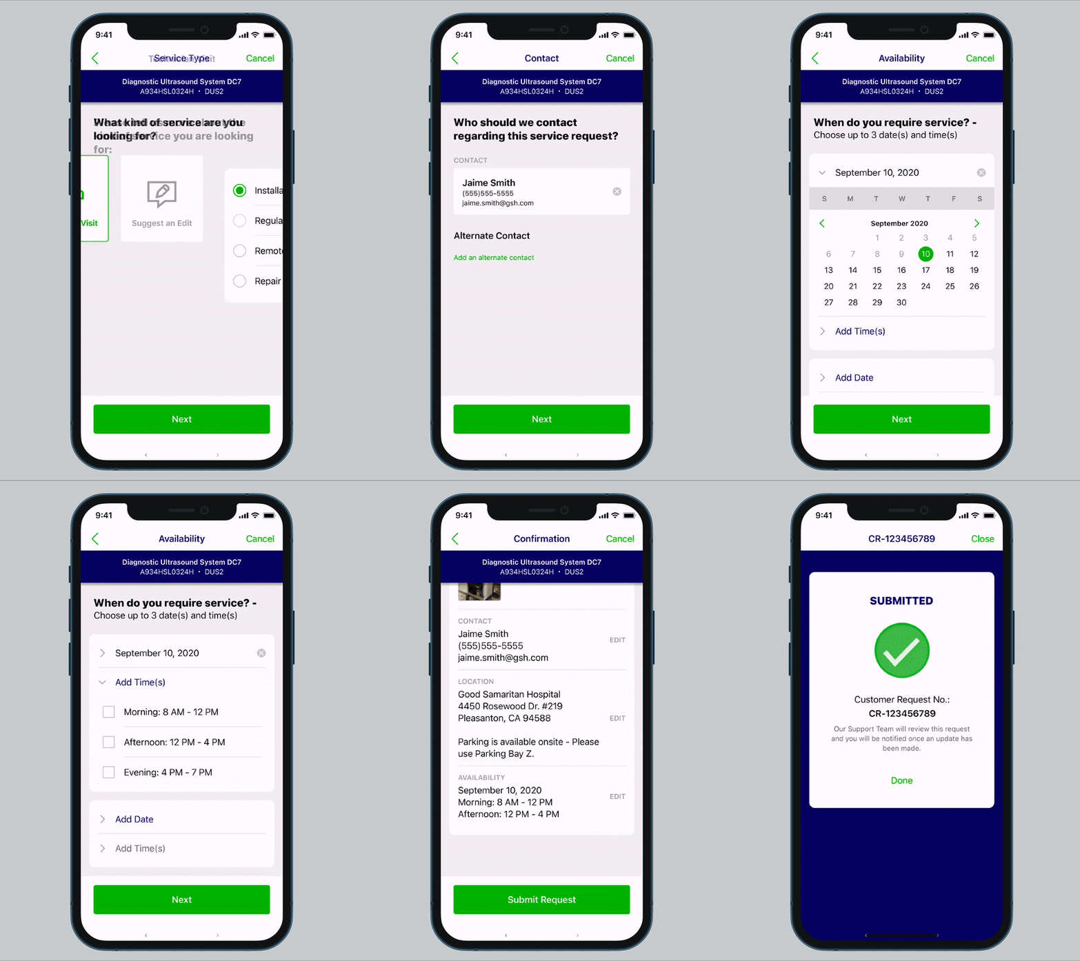
An intake form to capture, send, and store information regarding customers’ Asset issues.
When asset issues arise, customers complete an intake form so that they can provide important information to inform a technician’s work order. As a result, technicians can better prepare for the job and customers can help minimize downtime and increase first time fix rates—ultimately saving time and money.
Current
During a critical time as when an asset breaks down, the last thing a customer wants is to be redirected multiple times before starting a request for service.
Proposed
With Engage App, customer immediately knows where to turn to for help
Process
How might we increase service visibility via connection between service providers and customers, while streamlining the service request process?
Defining Success
Capture Relavant Info - Gather important details to diagnose the issue early and inform work orders so that technicians can arrive onsite equipped with the appropriate tools and parts to get the job done in a single visit.
Reduce Steps - Create an easy-to-use method of raising service requests to encourage and motivate customers to use it over phone and email.
Turnkey Solution - Reduce time to value by prioritizing turnkey features so that customization is an option, not a necessity.
Service Visibility - As service requests are raised, customers can track its lifecycle so that they know progress is being made and follow-up as needed.
Utilizing the MOSCOW method in the competitive audit to identify must haves, should haves, could haves, and won’t haves
Research
To get started, I conducted an audit of related products to gain a better understanding of intake flows used for collecting information that would result in an appointment. Because my goal was to create a turnkey experience with minimal configuration and more out-of-the-box solutions, I looked to familiar consumer apps like Apple Support, Tesla’s app, and Yelp’s Request-a-Quote feature to establish a baseline of what’s expected during this data collection process.
From this, I identified key foundational requirements to incorporate in V1 that would ultimately help our team have deeper conversations with customers to unravel the complexity inherent with B2B products. To build a successful intake flow, we needed to capture the following information from users:
Type of service
Problem description
Location
Date & time / Availability
Photos / Videos
Confirmation
Initial Designs
Based on these requirements, I put together a user flow in the form of sketches and initial mockups to share with my PM and the engineering team.
Initial user flow visualizing the key requirements drawn from consumer facing apps
Iteration 2
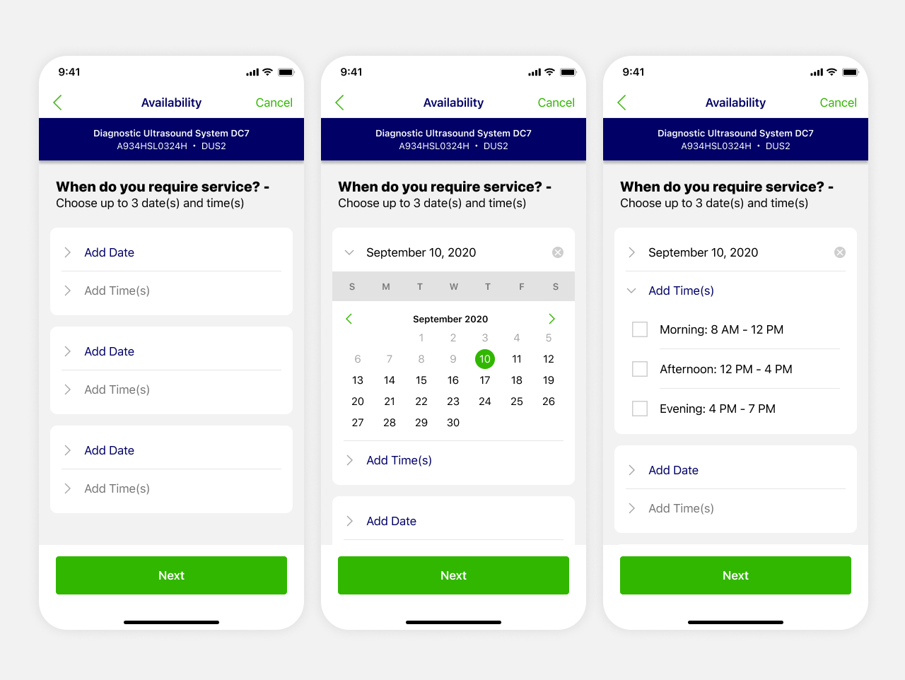
These initial designs were socialized with the Engineering team and we uncovered a technical limitation where displaying real-time appointment times would not be feasible in this initial release. The data model could not support this yet but it was going to be a significant tradeoff given this capability in consumer apps. We ultimately decided that it would not be worthwhile delaying the production of this intake flow and planned to revisit real-time appointment booking in the next release. Meanwhile, I explored an alternative design that would enable users to provide their general availability so that the dispatcher can prioritize and schedule according to customer’s as well as technician’s availability.
Final Date/Time Picker
After testing the second iteration with the design team, the day/time picker was causing confusion so I revisited the design and took a different approach. The goal was to make it immediately clear that this part of the intake is meant to capture the user’s availability. I utilized a traditional date picker so that it’s not only understood that this screen is intended to capture date and time but to also enable the user to select specific dates. We tested this approach with a customer in our beta program and received positive feedback. The technical limitation ended up being a blessing in disguise because this approach was preferred over real-time appointment bookings. This way, the business can have more control over the booking process to assure both business and customer needs are met.
Results
This solution shipped in Q1 of 2021 and garnered enough interest to land its first customer within months which was a great milestone given typically long sales cycles. It’s been growing ever since and we’re finding that customers are experiencing shorter implementation cycles with this product.


